Imagine this: you click on a website, only to encounter sluggish loading times, a cluttered design, and tiny fonts that make reading a chore. Frustrating, isn’t it? Now picture the opposite—a site that’s clean, intuitive, and designed to make you feel like it was tailored just for you. That’s the essence of a user-friendly website.
In today’s fast-paced digital age, your website isn’t just a platform; it’s the virtual front door to your brand or business. It’s often the very first interaction visitors have with you, and those first few seconds can make or break their impression. Your mission? Create a space where users feel comfortable, can quickly find what they need, and enjoy their experience.
In this blog, we’ll share actionable tips to turn your website into a user-friendly powerhouse. Whether you’re a seasoned designer or just starting out, these strategies will help you build a website that’s both functional and a pleasure to navigate. Let’s dive in and uncover how you can make your website the kind of place users want to stick around, explore, and even return to again and again.
Table Of Contents
Why User-Friendliness Matters
- Improved User Experience: A seamless and intuitive user journey enhances satisfaction, making visitors feel valued and understood.
- Increased Engagement: When a website is easy to navigate, users stay longer, explore more pages, and interact with your content.
- Boosted Conversions: A thoughtfully designed website isn’t just appealing—it’s effective. It can lead to higher sales, sign-ups, and inquiries.
- Enhanced Brand Reputation: A positive user experience reflects well on your brand, building trust and leaving a lasting impression.
- Better Search Engine Rankings: Search engines favor user-friendly websites, helping you climb higher in search results and reach a wider audience.
How to Enhance User Friendliness?
Creating a user-friendly website starts with intentional design choices that focus on simplicity and accessibility. Here’s how to make your site more welcoming and functional:
1. Clean and Intuitive Design

A great website feels effortless to navigate. Here’s how you can make that happen:
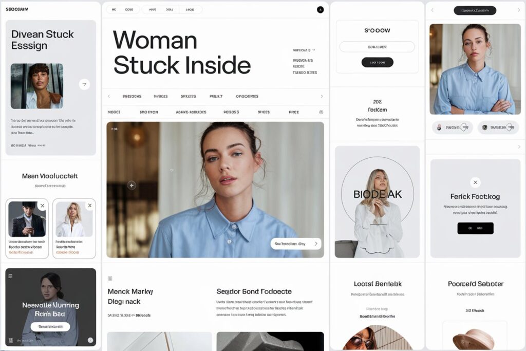
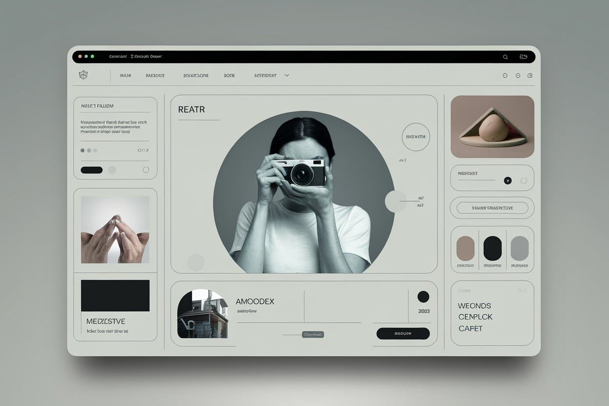
- Minimalistic Layout: Simplicity is key. Avoid overwhelming users with cluttered pages filled with excessive information or distracting visuals. Focus on what truly matters, and let whitespace breathe life into your design. A clean layout helps users find what they need quickly and stress-free.
- Clear Hierarchy: Structure your content so it’s easy to digest. Use headings, subheadings, and bullet points to organize information. This approach not only improves readability but also ensures users can quickly scan for the details they need.
- Consistent Formatting: Keep your website’s look and feel cohesive. Stick to a uniform color palette, font styles, and button designs. Consistency builds trust and prevents users from feeling disoriented or overwhelmed.
- Responsive Design: In today’s multi-device landscape, your website must shine on every screen. A responsive design adapts effortlessly to desktops, tablets, and smartphones, ensuring a smooth user experience across the board. Plus, with search engines prioritizing mobile-first indexing, this isn’t just a nice-to-have—it’s a must.
2. Fast Loading Speed
In an age where users demand near-instant results, a slow-loading website can drive visitors away. Studies reveal that even a one-second delay can drastically reduce user satisfaction and conversions. Here’s how to keep your website running at lightning speed:
- Optimize Images: Images often account for the majority of a site’s loading time. Use tools like TinyPNG or ImageOptim to compress images without sacrificing quality. Switch to modern formats like WebP for quicker loading and sharper visuals that impress.
- Minimize HTTP Requests: Each file your site loads—whether it’s an image, script, or stylesheet—requires an HTTP request. Reduce these by combining CSS and JavaScript files, removing redundant plugins, and trimming unnecessary third-party scripts. A leaner site means faster performance.
- Leverage Browser Caching: Improve load times for returning visitors by enabling browser caching. This allows users to load static files (like images and CSS) from their local device instead of fetching them from the server every time.
- Utilize a Reliable Hosting Provider: Your hosting provider is the backbone of your site’s speed and stability. Choose a provider known for fast servers and high uptime. For an extra boost, consider cloud hosting or Content Delivery Networks (CDNs) to distribute content efficiently and reliably.

Think of your website’s navigation as a roadmap for your visitors. If it’s confusing or disorganized, users may leave before finding what they need. Here’s how to create a navigation system that leads them seamlessly through your site:
- Clear Menu Structure: Your menu is the foundation of website navigation. Organize it logically, grouping similar topics together, and use clear, descriptive labels like “Services,” “Blog,” or “Contact.” Avoid vague terms that leave users guessing. A well-structured menu helps visitors quickly find the information they’re looking for.
- Breadcrumbs: Breadcrumbs are a simple yet powerful tool for guiding users. They show the path a visitor has taken (e.g., Home > Blog > SEO Tips), making it easy to backtrack or explore related content. Beyond improving user experience, breadcrumbs also enhance your site’s SEO by creating a clear content structure.
- Search Functionality: Not every visitor has the time or patience to sift through menus. A prominently placed search bar allows users to quickly find exactly what they’re looking for. Enhance this feature with auto-suggestions and filtering options for an even smoother experience.
- Intuitive Links: Every link on your website should clearly indicate where it leads. Avoid vague phrases like “Click here” or “Read more.” Instead, use concise and descriptive link text like “Download Our Guide” or “Explore Our Services.” This improves user trust and ensures accessibility for all, including screen reader users.
4. Mobile-First Approach
With mobile devices dominating web traffic, designing with a mobile-first mindset is no longer optional—it’s essential. Prioritize the mobile experience to ensure your website is accessible and enjoyable for users on smaller screens. Here’s how to make it happen:
- Touch-Friendly Design: Mobile users navigate by touch, so interactive elements like buttons and links must be easy to tap. Avoid crowding elements together and ensure a minimum touch target size of 48×48 pixels. This reduces frustration and enhances usability.
- Quick Loading Times: Speed matters, especially on mobile. Compress images, streamline heavy scripts, and leverage a mobile-optimized Content Delivery Network (CDN) to ensure fast loading. With Google factoring mobile speed into rankings, this isn’t just good for users—it’s great for SEO.
- Easy-to-Read Fonts: Fonts play a crucial role in mobile readability. Opt for clear, legible typefaces and use a minimum size of 16px for body text. Ensure there’s enough contrast between text and background to reduce eye strain and improve user experience.
- Simplified Forms: Filling out forms on a mobile device can feel tedious. Keep forms concise by only asking for essential information. Implement mobile-friendly features like autofill, dropdown menus, and checkboxes to make the process faster and hassle-free.
5. Accessible Design

Accessibility ensures that everyone, regardless of ability, can interact with your website seamlessly. By creating an inclusive experience, you not only expand your audience but also showcase your commitment to equality. Here’s how to make your website more accessible:
- Alternative Text for Images: Add descriptive alt text to all images. This allows screen readers to convey the purpose of images to visually impaired users. For example, instead of “Image123.jpg,” use something descriptive like “A smiling woman holding a cup of coffee in a cozy cafe.” Alt text also enhances SEO by helping search engines understand your visuals.
- Keyboard Navigation: Some users depend on keyboards to navigate, especially those with mobility impairments. Ensure your site supports full keyboard navigation by testing features like tabbing through links, buttons, and form fields. A visually distinct focus state lets users easily identify where they are on the page.
- Color Contrast: Low color contrast can make text and other elements hard to distinguish for users with visual impairments. Use tools like WebAIM’s Contrast Checker to ensure adequate contrast between text and background. Aim for a minimum contrast ratio of 4.5:1 for body text and 3:1 for larger text.
6. Clear and Concise Content
Even a beautifully designed website can fail to impress if its content is confusing or overwhelming. Clear, concise, and actionable content keeps users engaged while ensuring they understand your message. Here’s how to craft content that works:
- Scannable Content: Most users skim rather than read every word. Make your content scannable with descriptive headings, bullet points, and short paragraphs. Breaking up large blocks of text improves readability and helps users quickly find the information they’re looking for.
- Simple Language: Avoid losing your audience with complex words or overly technical terms. Use simple, conversational language that speaks to a broad audience. Prioritize clarity over complexity, and aim for a friendly, approachable tone that everyone can understand.
- Strong Call-to-Action: Guide your users by including clear and actionable prompts like “Sign Up Now,” “Learn More,” or “Download Our Free Guide.” Strategically place these CTAs throughout your site to direct users toward key actions, whether it’s making a purchase, subscribing to a newsletter, or exploring more content.

Modern Trends in User-Friendly Web Design
Web design constantly evolves to meet changing user expectations and advancements in technology. Staying on top of the latest trends ensures your website stays relevant, engaging, and ahead of the competition. Here are some modern trends transforming user-friendly web design:
- Dark Mode: Dark mode has surged in popularity for its ability to reduce eye strain, especially in low-light environments. Offering a dark mode option not only improves user comfort but also lends your website a sleek, contemporary vibe. Including a toggle between light and dark modes empowers users to choose their preferred experience.
- Chatbots: Instant support can dramatically enhance user experience. AI-powered chatbots provide real-time assistance, handle FAQs, and guide users through tasks like troubleshooting or shopping. They deliver a personal touch and keep users engaged without requiring 24/7 human availability.
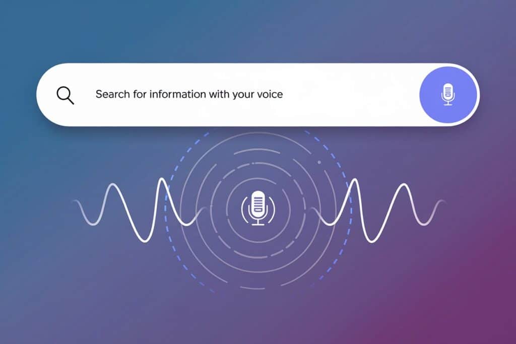
- Voice Search Optimization: With the rise of smart speakers and voice-activated devices, optimizing your content for voice search is becoming essential. Focus on conversational language, long-tail keywords, and concise answers to common questions to make your site more voice-friendly.
- Augmented Reality (AR) and Virtual Reality (VR): AR and VR are reshaping how users interact with websites. From virtually trying on clothes to exploring a hotel room or visualizing furniture in their space, these immersive experiences leave a lasting impression. While not suitable for all industries, they can be game-changers for businesses in retail, hospitality, and design.
- Personalization: Users appreciate content tailored to their preferences. Leverage data to offer personalized recommendations, such as products, articles, or services based on past interactions. Features like “Recommended for You” sections make your site feel more relevant and engaging to individual users.
Note – You can access next level projects to make your website stand out on my Projects page.
Conclusion
By applying these tips and keeping up with modern trends, you can design a website that not only looks stunning but also provides a smooth and enjoyable user experience. A user-friendly website isn’t just an aesthetic choice—it’s a powerful tool that can help you reach your online goals and leave a lasting impression on your audience.


Hi I am so delighted I found your blog page, I really found you by accident, while I was researching on Aol for something else,
Anyways I am here now and would just like to say kudos
for a incredible post and a all round thrilling blog (I also love the theme/design), I don’t have time to go through it all at the minute
but I have saved it and also included your RSS feeds, so when I have time I will be back to read more, Please do keep
up the great job.
Please let me know if you’re looking for a article
author for your blog. You have some really great posts and I believe I would
be a good asset. If you ever want to take some of the load off,
I’d absolutely love to write some content for your blog in exchange for a link back to mine.
Please blast me an e-mail if interested. Many thanks!